Your Whole House Interior Paint Guide
Choosing a whole-house paint color can feel overwhelming, especially with endless options on the store shelves. When a color is going to cover every wall, neutrals are almost always the safest and most versatile foundation. Crisp whites create a clean backdrop that lets furniture, accessories and art stand out. Softer alternatives like stone whites, muted greiges and buttery creams feel warm and modern without leaning cold, and they pair beautifully with natural materials such as oak, linen and marble.

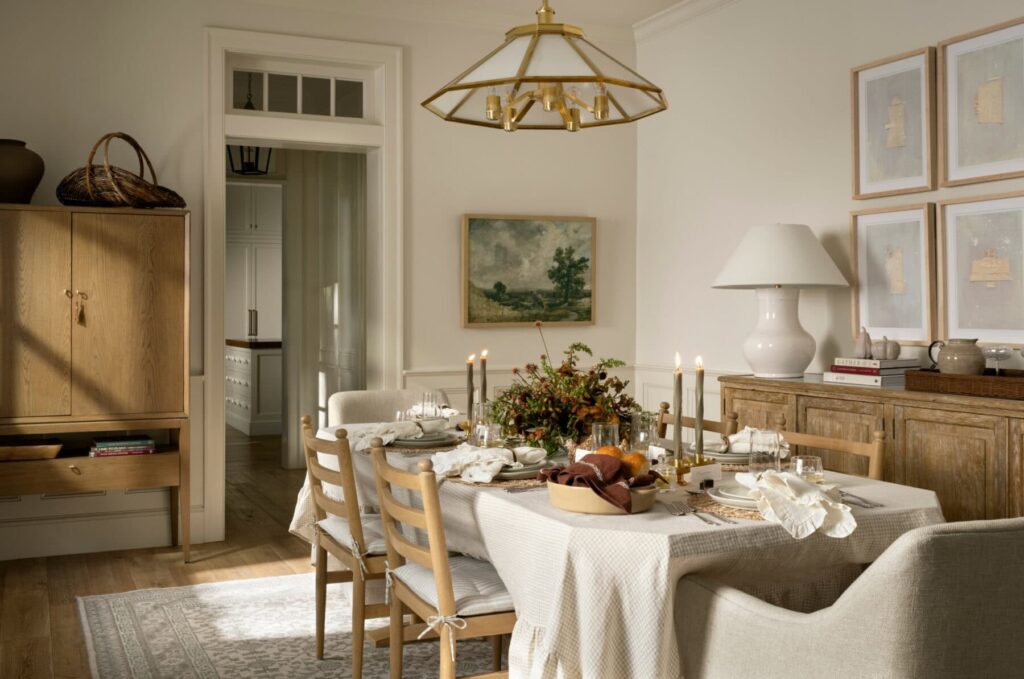
Below are several neutral shades that consistently perform well across full interiors:
- Benjamin Moore Swiss Coffee (75 percent): A balanced white greige that stays soft from morning through evening
- Farrow and Ball Dimity: A warm white with subtle depth that adds quiet character
- Bauwerk Bone Limewash: A natural, textured finish that builds movement and patina
- Farrow and Ball Wimborne White: A timeless creamy white suited to both historic and contemporary homes
- Benjamin Moore Chantilly Lace: A crisp, clean white with no undertones
- Benjamin Moore Simply White: A slightly warmer white that works almost anywhere
- Sherwin Williams Alabaster: A warm, cozy white that does not skew yellow
For those who want more personality throughout the home, non-neutral options can still function as cohesive whole-house colors when chosen thoughtfully. Earth-based tones often act like neutrals and create a grounded, natural feel. Soft clay, muted sage, deep terra cotta, oxblood and stormy blue gray all carry emotion while maintaining harmony across multiple rooms.

Choosing one color for an entire home requires more care than selecting a single-room shade. Natural light, shadows and architectural features change how color appears throughout the day. The most reliable method is to paint large samples in multiple rooms and observe them over several days. Color reveals itself gradually, and the ideal choice is the one that maintains a consistent mood across the entire house.
A few general guidelines can help narrow the options:
- Homes with ample natural light can support crisp whites as well as both warm and cool tones
- Homes with low light or north-facing orientation tend to make colors appear darker, so warm undertones help create a welcoming feel
After selecting a color, choosing the right sheen is the final step. Satin or eggshell finishes work well on most walls, providing soft reflection without highlighting imperfections. Ceilings perform best in a flat finish to reduce glare. Trim, doors and millwork typically look their best in satin or semi-gloss to highlight architectural detail.
Thoughtful whole-house color selection can transform the feel of a home and significantly elevate its presentation, especially when preparing for market. For help choosing the right palette or creating a cohesive design plan before listing, reach out anytime to discuss strategy and next steps!